Formatting charts
Leveraging facts through well-designed graphs can significantly impact your ability to persuade. This article outlines how to effectively format charts, illustrated with Covid statistics.
The Facts
| Periods | Deceiced # |
| 2009 | 134235 |
| 2010 | 136058 |
| 2011 | 135741 |
| 2012 | 140813 |
| 2013 | 141245 |
| 2014 | 139223 |
| 2015 | 147134 |
| 2016 | 148997 |
| 2017 | 150214 |
| 2018 | 153363 |
| 2019 | 151885 |
| 2020 | 168566 |
To provide a concrete example, I revisited the data from the Dutch Statistics Bureau (CBS). I compiled the annual mortality rates of the Dutch population into Excel and uncovered the following:
- Compared to the total population of 17,474,693 in 2020, there was an excess mortality rate of 0.063 percent over what would be expected in a typical year;
- Recent years' mortality rates are as follows:
Graphic Design and Framing
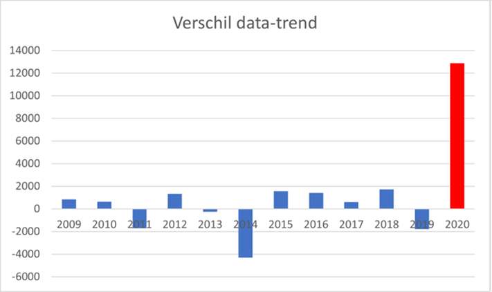
Now, let's focus on the construction of graphs. The data mentioned can be illustrated in several ways. If you view the numbers as deeply concerning and believe strict adherence to guidelines is necessary, you might choose to represent the graph as follows:

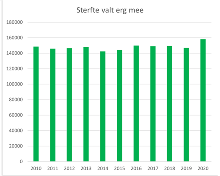
Conversely, if you see the figures as not particularly alarming and feel that the government's measures are too harsh for what is essentially a flu virus, then you might opt to display the graph like this:

Conclusion
The utilization of color, the decision to present absolute numbers (for a more direct comparison) or to focus on differences (to highlight changes over time), and the choice of a graph title enable the creation of two distinctly different graphs from the same dataset.